Leaves Motif
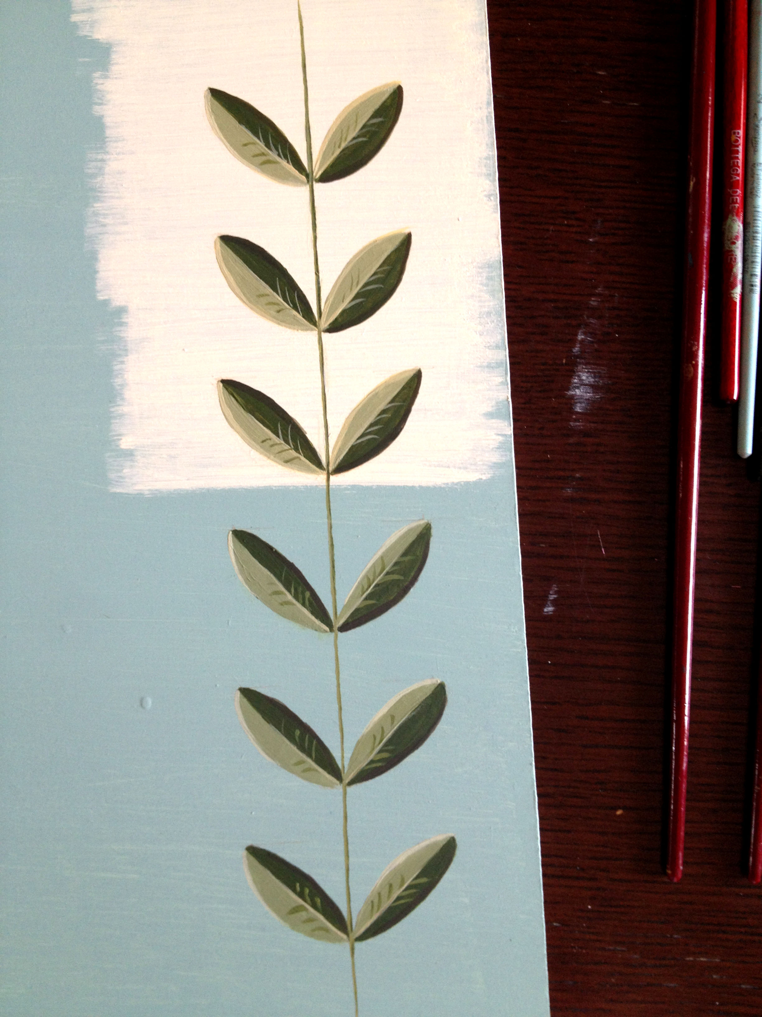
This leaves motif is an example I use for my decorative class. It is an acrylic paint on a wooden board realized to point out how a background color choice can have an effect on a decoration. On the upper part of the project there is a warm light cream background that enhances the green leaves motif, and a cold light blue that tends to reduce the attention from the decoration on the bottom half. Two diverse solutions meant for different purposes.
Choosing the first combination leads to focus more on the decoration. In general, a background color that makes the chosen motif pop out is the result of warm colors on cold ones (or vice versa), and light and dark contrast. Vibrant decorative solutions are perfect for environments in which an active atmosphere prevails, such as a kitchen, or a playroom.
On the other hand the combination of cold colors, and less light/dark contrast is usually suggested for relaxing, neutral surroundings.