The Island and the Sea – L’Isola e il Mare

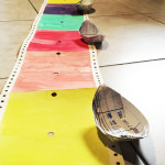
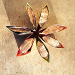
This is an artist’s book I have made for a project called Post Scriptum. It involved the use of old library cards, from 9 to 30 pieces, to create any kind of book, not bigger than 25 x 35 cm, that would allow the sheets to be half-seen. After a month of brainstorming by creating shapes, folding cards, and looking at the material from different angles, I noticed how the idea of doing a house always tried to take shape out of those sheets. I painted the long paper sequence as Venetian house walls, respecting the folded division of the cards. I kept playing with paper until managing to make some windows with shutters and several boat origami. The bright colors and shapes suggested a maritime landscape, so I decided to keep the idea of a Venetian island. I coated the shutters with a dark green shade and the boats with a warm brown. A bright light watercolor layer on the windows encourages the viewer to peek into the houses. Multicolor embroidered curtains hang on the windows allowing the viewer to see just a little of what is beneath, as if to protect the household’s intimacy. Sea life decorations alternate on the walls in order to highlight the fact that it’s a fisherman’s town. Like thin laces, blue and white waves decorate the bottom of the houses,”tickling the wooden boats’ backs“. The interior side has been covered with colorful wallpaper, and transparent sheets have been framed and placed on the inner windows. Last but not least, words were given to this book, now ready to be named The Island and the Sea and to share its story. The choice of placing a text on the inside of the houses is a warm invitation for the viewer to get to know better the inner soul held between the island walls.


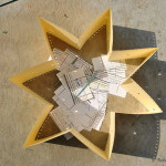
Ho realizzato questo libro d’artista per un progetto chiamato Post Scriptum. L’idea implicava l’utilizzo di vecchie tessere di biblioteca, in un numero compreso tra 9 e 30, lasciando intravedere le date e le scritte impresse su di esse, per creare, a tema libero, un libro che da chiuso non superasse i 25×35 cm. Dopo un mese passato creando forme, piegando tessere e guardando la struttura cartacea da svariati punti di vista, ho notato come l’idea di casa sembrasse costantemente voler prender corpo. Ho così steso la lunga sequenza di schede iniziando a dipingerle come casette a schiera, cambiando colore all’alternarsi delle pieghe della carta. Ho poi continuato a giocare con le tessere ottenendo delle finestre con imposte e degli origami raffiguranti barche. Forme e colori suggerivano un paesaggio di mare veneziano. Le imposte sono state colorate di verde scuro e le barche di un marrone caldo che richiama il legno. Una velatura luminosa e’ stata stesa sulle finestre come per voler permettere all’osservatore una sbirciatina verso l’interno delle case. Tendine colorate e ricamate a mano coprono a meta’ le finestre per proteggere parzialmente l’intimità della vita svolta oltre le mura. Sulle pareti si alternano motivi marittimi per sottolineare che si tratta di abitazioni di pescatori. Come un sottile pizzo di fili bianchi e blu, piccole onde ricamano il fondo dei muri variopinti “solleticando i dorsi delle barche di legno“. Le pareti interne sono state rivestite con colorate carte da parati e fogli trasparenti sono stai incorniciati su ciascuna di esse combaciando con le finestre esterne. Il libro ha poi preso parola, pronto ad essere chiamato L’Isola e il Mare e a raccontare di se‘. La scelta non casuale di porre il testo all’interno delle abitazioni e’ un sentito invito a voler far conoscere più a fondo l’anima racchiusa tra le mura dell’isola.